On Mancine
In 2018, type designer Phaedra Charles released her guide on Sinistral Hand, a broad pen script she specifically designed for left-handed calligraphers.
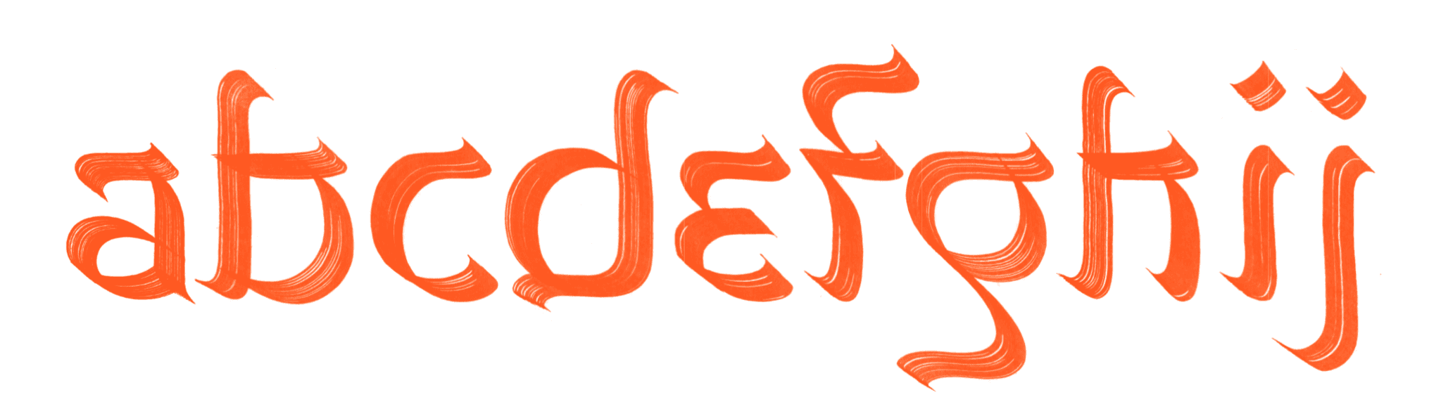
Why is that a big deal? Well, more or less all Latin typefaces have roots in hand-written letters. The majority of these letters were written with a broad pen. The combination of the shape of this writing instrument and the mechanics of the human wrist joint, dictate that it is easiest to hold this pen in a manner where the nib touches the paper at an angle between 10-70 degrees—if the pen is held in the right hand, that is. Most classic serif fonts lend their structures to a 30° pen angle, even now, hundreds of years after the transition from writing to printing.
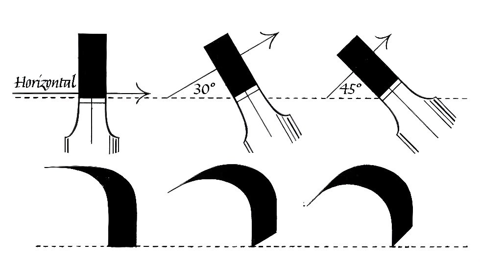
A broad nib, held at consistent angle, will produce variations in line thickness based on the direction of the stroke. Image source.
Left-handedness is a trait which the easily misguided human mind has often stigmatized, in many cultures throughout history. In the Western world, it was common for teachers to “correct” left handedness by forcing children to write with their non-dominant right hand well into the 20th century. And even today, challenges remain, albeit through thoughtlessness rather than bias. Scissors, computers and power tools are almost always designed for the right-handed majority, forcing lefties into un-ergonomical or downright dangerous positions to fulfill the same tasks righties take for granted.
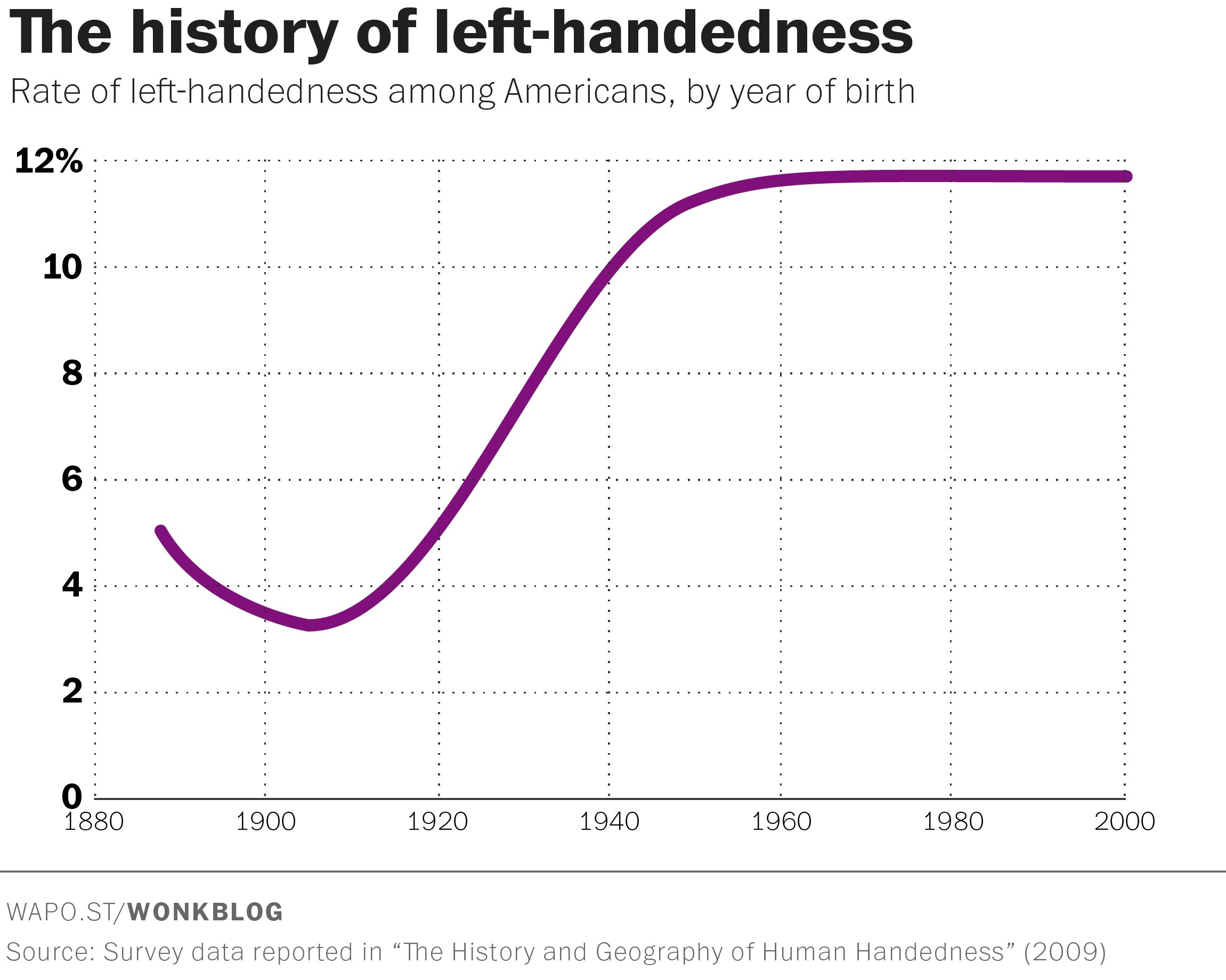
Of course, left-handedness hasn’t magically increased over the past century—we just stopped beating people up for it.
So it goes for the broad-nibbed pen, or rather, for the scripts we write with it. While the broad pen is easily held at that 30° angle with the right hand, the left-handed scribe is forced to make awkward adjustments. Either one can rotate the paper 90° and write from top to bottom, or one can angle their arm into a hook—not even to mention the ink smearing by the hand dragging over the freshly written letters. These are just concessions a lefty will have to make to write scripts like foundational, chancery, or textura quadrata. But why force oneself to adopt the dogma of your oppressor? Why must a pen be held at 30° anyway?
With that thought in mind, Phaedra developed her Sinistral hand, which flips the pen to an angle of about 150°. It looks completely different from any Latin scripts you’ve seen before. Although the letters remain recognizable as themselves (as is typically required of letters), they also remind of Hebrew or Devanagari. Phaedra herself credits these as sources of inspiration. Devanagari is traditionally written at a pen angle of about 150°, and Hebrew has a counter-momentum construction much like sinistral—essentially meaning that stroke endings point opposite to the reading direction.
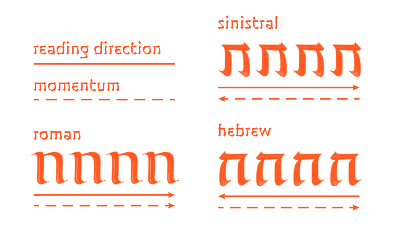
Diagram showing similarities between sinistral and Hebrew. Taken from “A Guide to Sinistral Hand”.
To fully understand the intricacies of sinistral hand, I encourage you to read Phaedra’s guide, which she has published libre, rather than my summary of it.
However, this was an indispensable introduction, because without Sinistral, Mancine wouldn’t exist.
Walking the uncanny valley
In 2020, having just gotten into type design and eager to make my mark, I first set out to put my own spin on a lefty-contrasted font. At the time, I wondered what might happen if a more traditional letter-skeleton may be written at 150°—essentially a foundational hand with reversed contrast. The answer, as it turned out, was not very pretty.
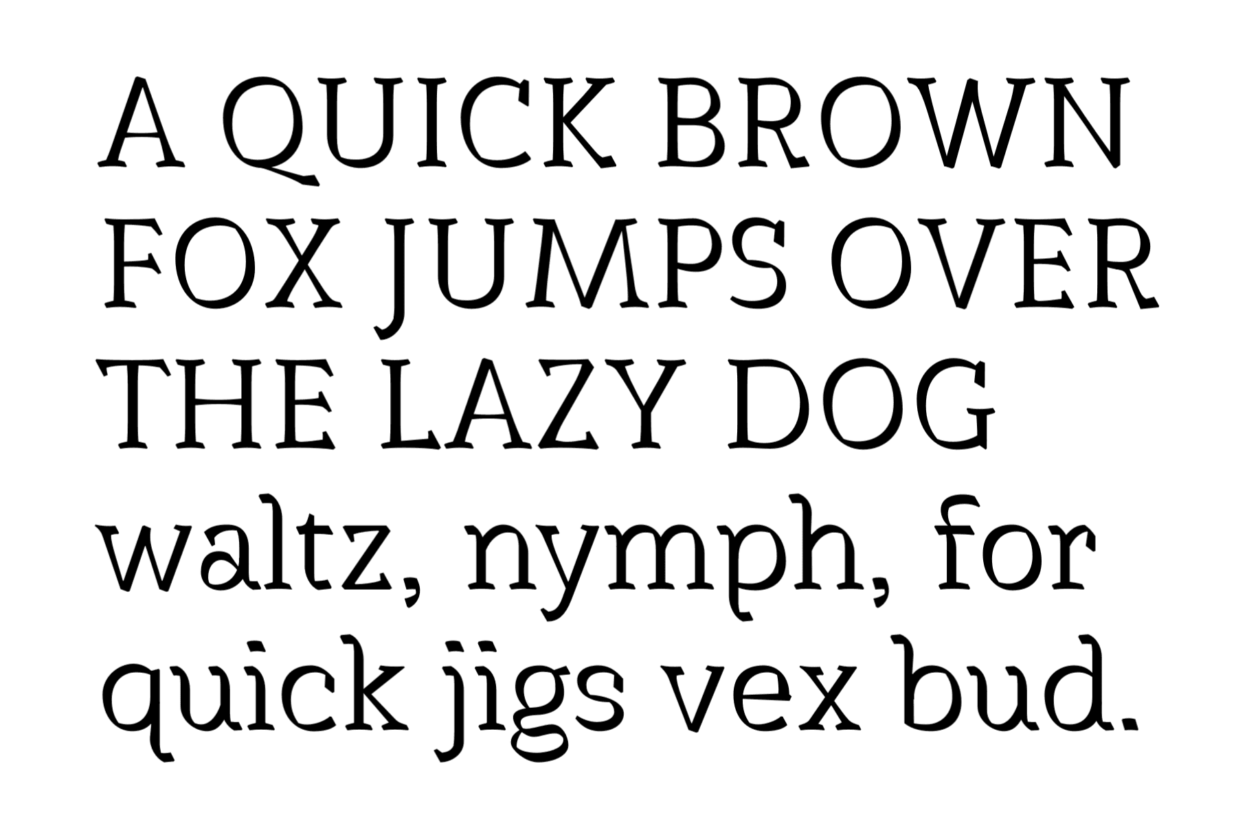
We are taught to think of the base shapes of letters as monolinear skeletons—simply made from lines, with no weight or contrast. As such, it’s easy to let ourselves believe that those skeletons are the paragons, to which contrast can be applied in one way or another as a secondary thought. But in fact, those skeletal forms developed alongside the pen and the weight it gave them: the pen influences the way in which a letter’s skeleton may look good, and how it may not (a comparison: muscle and bone, which are interdependent).
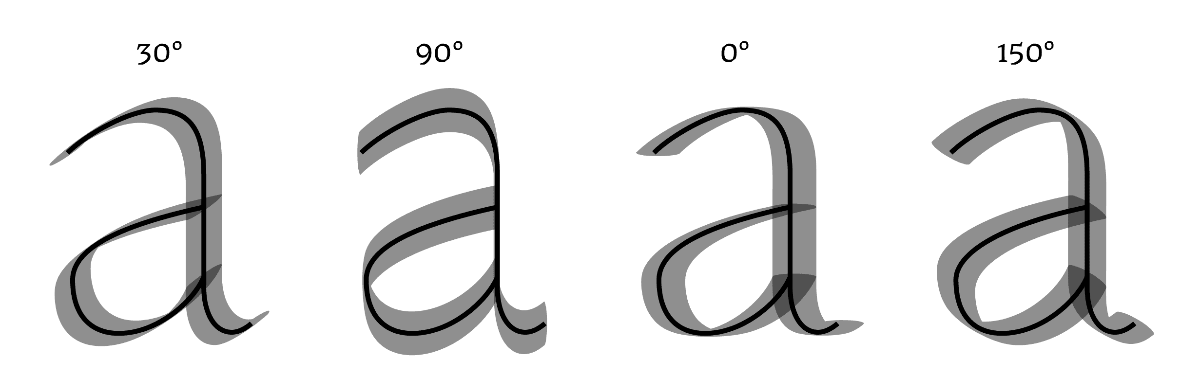
Skeleton and muscle. The same letter skeleton with a broad pen’s contrast applied to it at various angles. As this skeleton is optimized for 30°, the other angles don’t look so great, but could have potential with a different skeleton.
What is “good”, here? A challenge of the 150° model is that it isn’t always clear whether a letter looks ugly because it truly is ugly, or because it looks too far off from the norm, confusing and insulting our brains with its wrongness. Some elements of the alphabet shown above are just plain hideous to me: the flag serifs on letters like “n”, the tail on the “Q”, the bit of weight in the spine of “S” and “s”, the overall uncomfortableness of “g”. That’s without going into more foundational issues like a poor sense of proportion, which I attribute more to my lack of experience at the time than to the contrast model.
But regardless, a lesson can be learned here: this contrast model doesn’t work on a traditional Roman skeleton, because it walks the uncanny valley.
The uncanny valley is a hypothesis that objects made to look like humans tend to frighten us only when they are pretty close to looking like a human, but don’t quite get there. A cartoon character is so far removed from a real human that we can accept it as cute or humorous, but not so much a wax doll, or a poorly rendered CGI cat-human in the 2019 film adaptation of Cats.
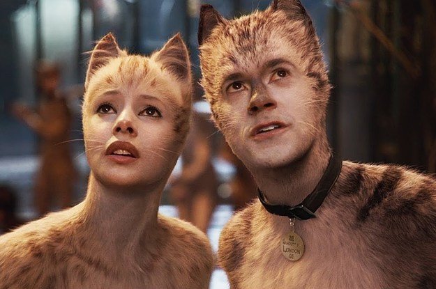
A similar place exists for letterforms. We are exposed every day to solid, traditional fonts—Garamonds, Helveticas, Times New Romans— and to witness a not-quite-right mimicry gives us goosebumps.
This reaction may be less strong for letterforms than for human faces (which makes sense—facial recognition functions long before we learn how to read), but it is there nonetheless.
With this realization, and a bit more type drawing experience, I gave it a second shot. This time, I allowed myself the freedom to make something strange, not reminiscent of letterforms that have been drawn before.
The process of Mancine
As is the origin of so many typefaces, it started with a piece of lettering I made for my dead dog, Mister (and I am sorry to make you think about dogs dying while reading a piece about type design, but such is the breath of the human experience). I’d already been thinking about the 150° model for a while, and wanted to see if I could make it look elegant, enough so even for an In Memoriam.
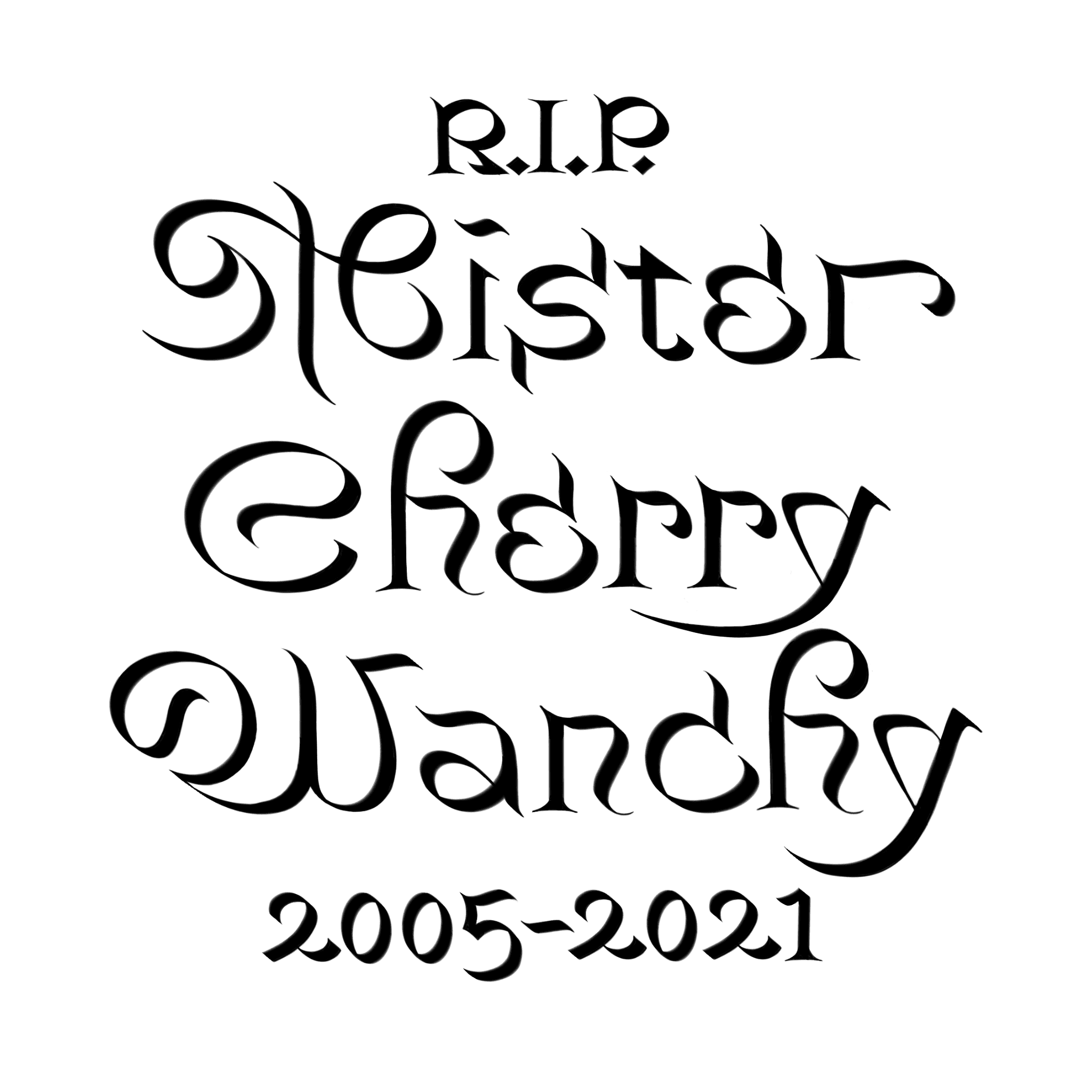
You can already see a lot of the DNA for Mancine being born in this primordial lettering stew. While I found the letter M to be the most exciting discovery, I also attempted some more daring lowercase forms which are far enough removed from the well-known to no longer tread the uncanny valley.
I appreciated the suggestion of Art Nouveau in these forms, and decided my typeface should continue that direction. It also felt very calligraphic still, despite allowing itself some rationalized (non-calligraphic) choices, like serifs on both sides of a stem, and a more fine-tuned drawing quality.
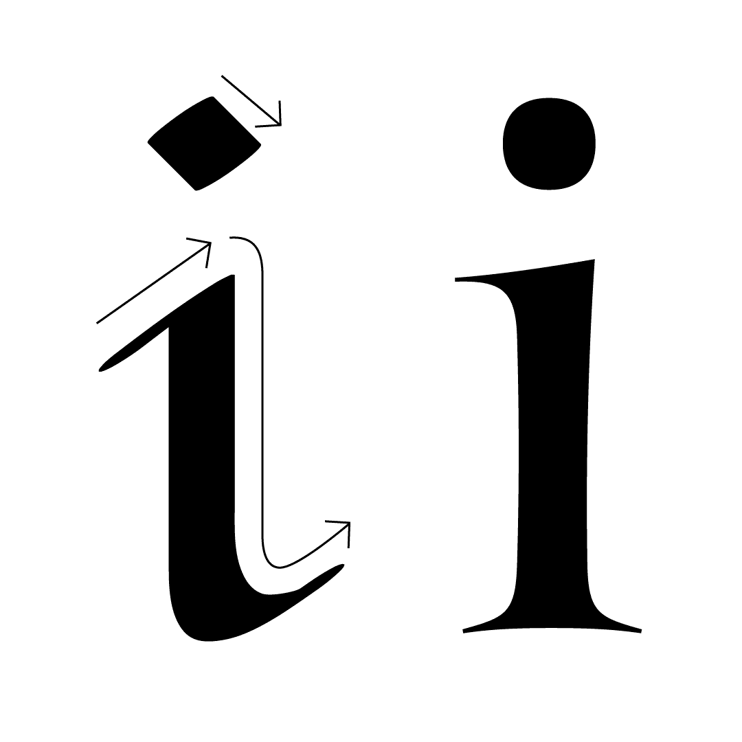
The shape of a written letter (left) is bound to the pen it is written with. A drawn, “rationalized” letter (right, from my typeface Fang) may take inspiration from the written letter, but may also do as it damn well pleases.
It took a year-and-a-half to develop a full lowercase that I was somewhat satisfied with. James Edmondson once said that once you get your idea down, the letters just kinda draw themselves. I strongly relate to that feeling, but not here: Mancine was a continuous struggle. I used a broad nibbed pen to write sheets full of a single letter, trying to find one version that found the right balance between weird, elegant, and legible.
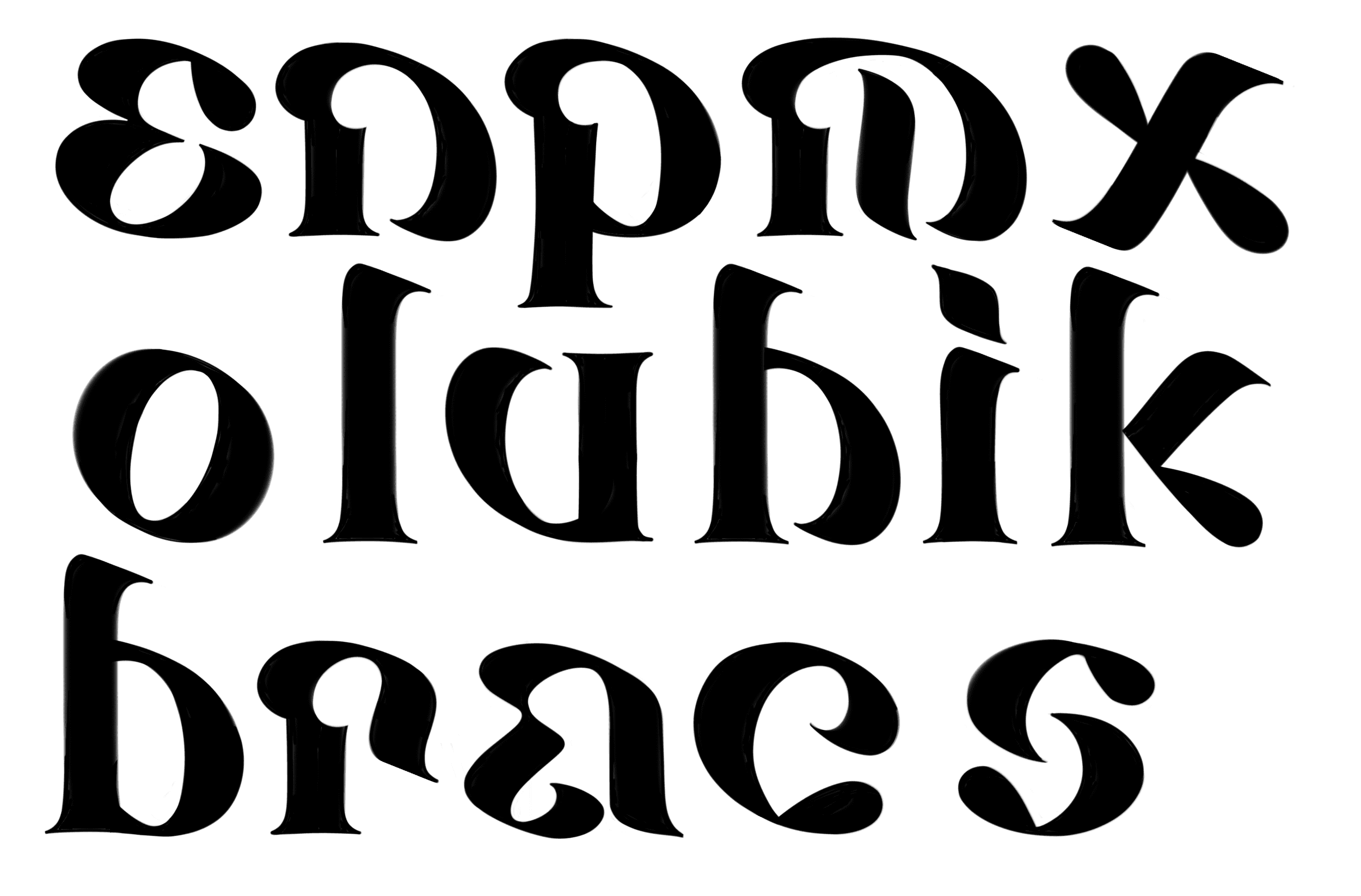
Early iterations that didn’t quite make the cut.
One way to find letterforms that work within a 150° model, is to take a normal letter written at 30°, and flip it horizontally.
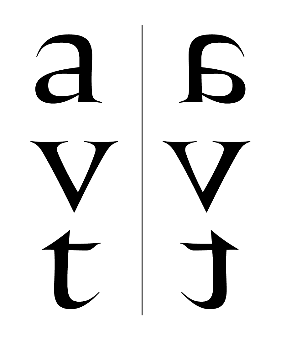
The a, v, and t in Fang, flipped. The a is unrecognizable. The v reads perfectly fine. Whether that t works depends on how hard you like to party.
There’s certain letters where the flipped version just makes sense, particularly symmetrical ones like v and w. Even so, this method could only be used to a certain degree, lest you’d end up with a completely flipped alphabet, which is gimmicky and not particularly pretty. In the end, most letters required wholly new forms.
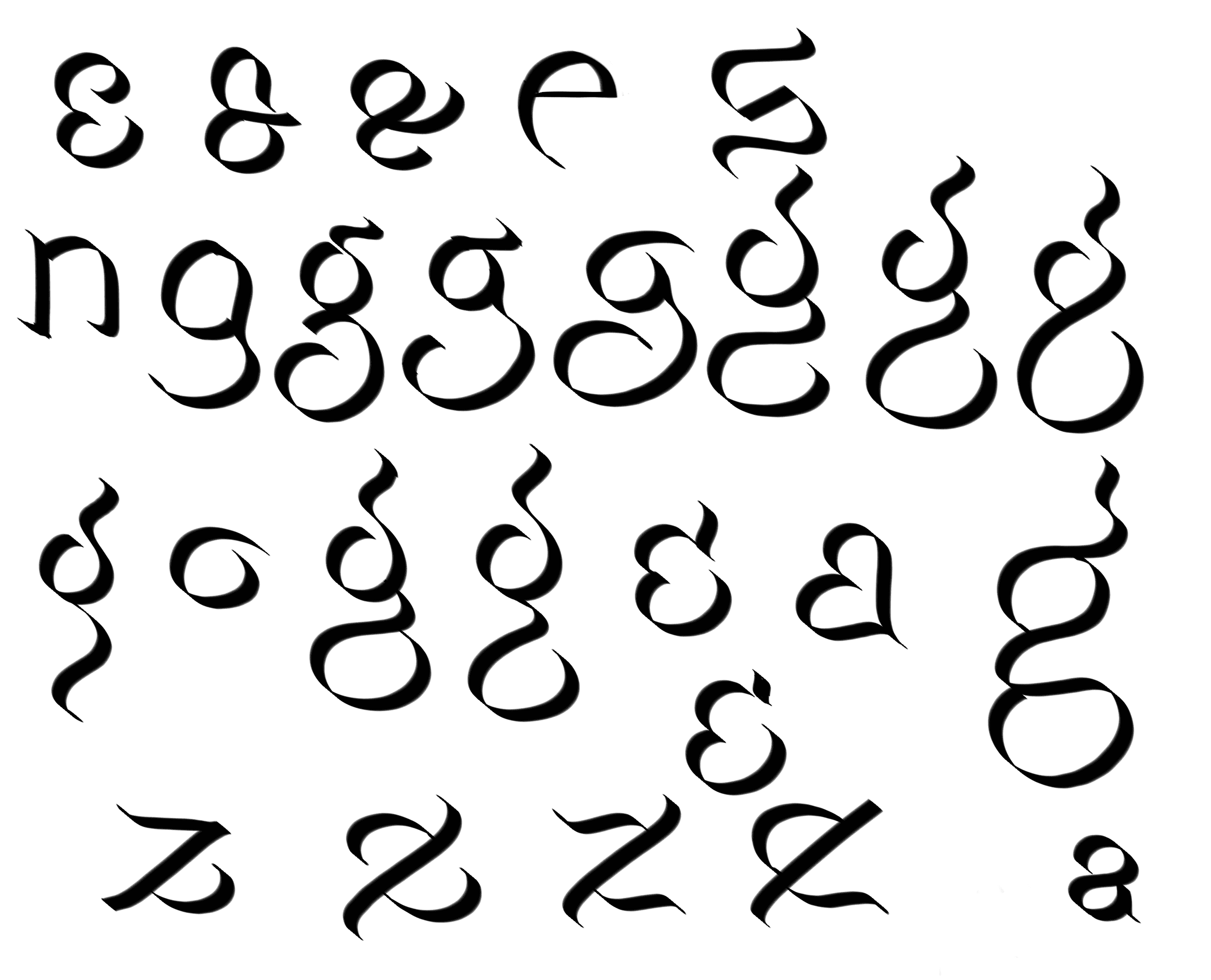
A few early sketches, trying to figure out a nice ‘g’ without flipping the whole thing.
A big question in the 150° model is how to handle shoulder joints (you’ll have noticed by now that type and anatomy share a lot of jargon). In a 30° model lowercase “n”, the shoulder gets nice and thin as it joins into the stem. In my model, the stroke is at its thickest here, creating an inelegant mass, which especially becomes an issue in the bolder weights.
Sinistral handles this by making the stem join the shoulder (if you can even call it a shoulder anymore) from below. The dead-dog lettering above tried to reverse the angle at which the shoulder meets the stem, using a little upwards twist.
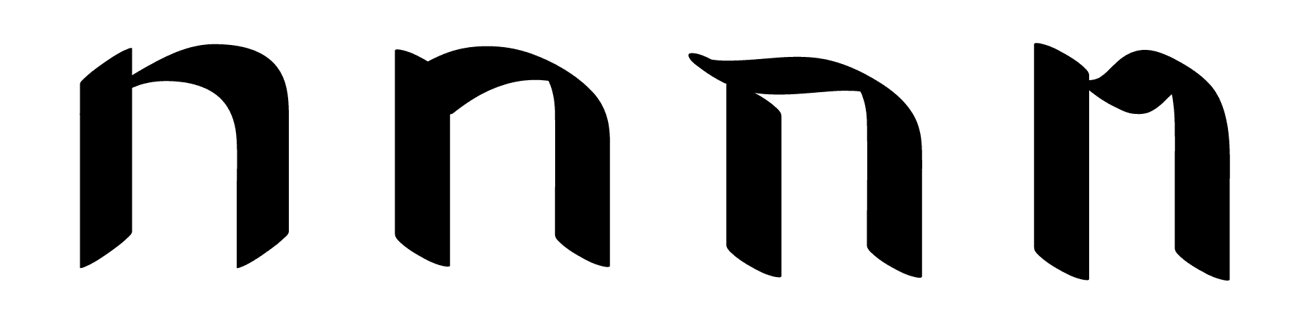
The shoulder joint in n: standard 30 degree model with a thin joint, an inverted 130 degree model with a thick massing at the joint, and two methods to attempt to subvert this issue
After much deliberation, Mancine faced the problem head-on, allowing itself a heavy shoulder joint (albeit with a bit of optical correction). I found it matched other letters like o, b, p and q better, and provided a sturdy foundation for more whimsical fellas like e and g.
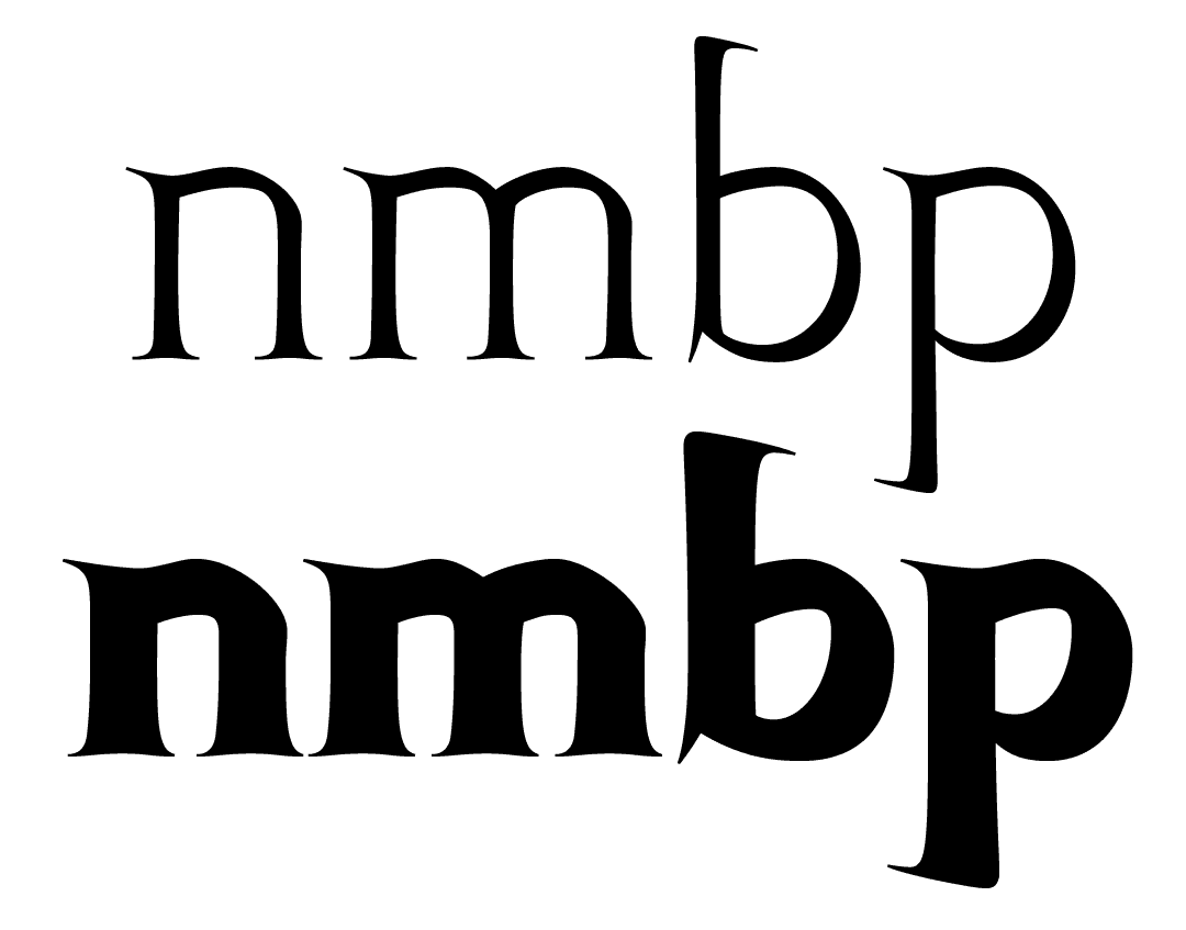
Note that horizontal strokes are a bit lighter than the vertical strokes. Not calligraphically correct, but it helps with massing.
The uppercase was even harder. Where the lowercase has some degree of modesty, I wanted all of my uppercase letters to present the same degree of lunacy as my “M”. This too required a lot of trial and error.
A different style of calligraphy served as inspiration here: French Roundhand. A script style developed in the 17th century, it too features a simple but elegant lowercase with a small x-height, and wild flourished capitals. While none of these letterforms could directly be borrowed on account of the contrast-model difference, the influence is clear.
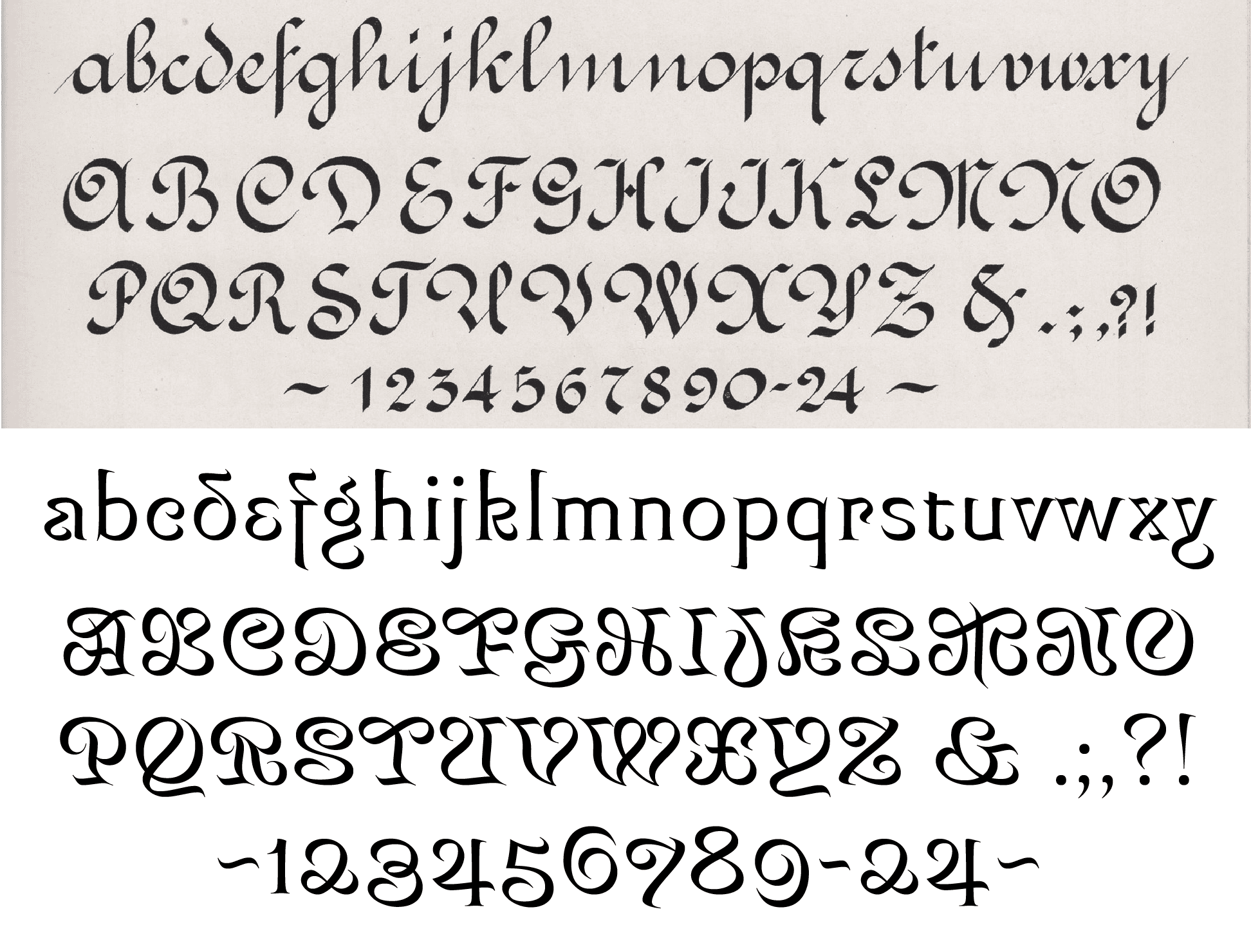
French Roundhand, skillfully written by Mas Grimes, as compared to Mancine.
The capitals turned out so wild that I realized Mancine was going to have a difficult time functioning all-caps. While I’d love not to worry about that, I find that’s how they are set half the time I spot my fonts in the wild. I get it, it looks nice.
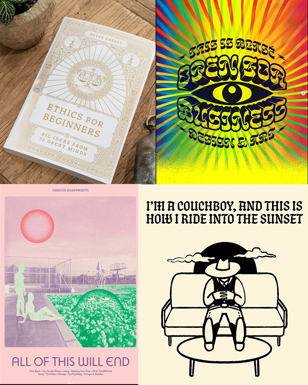
Clockwise from top left, Thanatos in use by Peter Voth, Wanchy in use by ThisisBlasé, Schmaltzy in use by Michal Loba, Bonkus in use by SecretlySwedish.
I wanted my wild swashy caps to be default, but also to give users an option for simpler capitals in an all-caps context. Cool person Matthew Smith suggested “trailing caps” could be a nice way to implement them. These trailing caps, coded as contextual alternates, would replace all capitals after an initial swashy cap with a simplified version (hence ‘trailing’ the initial capital).
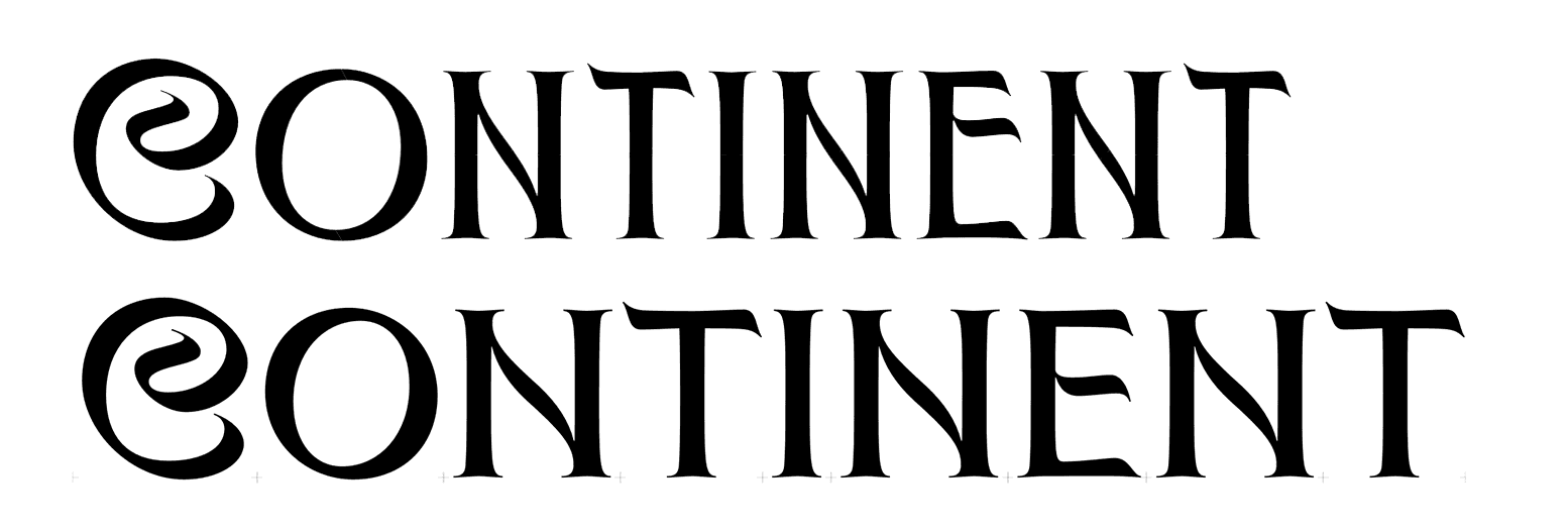
Still, designing the simplified versions wasn’t that easy. I wanted to retain that Art Nouveau-ish flair, but wasn’t quite sure how. One attempt was through exaggerating proportions. A common treatment in Nouveau and Deco letterforms is to have wide, perfectly circular round letters (O, C, G, Q), and condensing all others.

MD Nichrome by Mass-Driver beautifully demonstrates the striking simplicity of exaggerated proportional contrast.
This contrast looks cool in a geometric sans, but applied to my typeface, it just became incoherent. Too many ideas fighting for recognition: it’s calligraphic, it uses a rare inverted contrast model, it’s swashy, oh, and now it has unusual proportions too? Pick a lane, man. Besides, the condensed caps didn’t match the lowercase.
Once I made the proportions more orderly, I could see things working out for me. Art Nouveau flair remained through funky letterforms, without trying to do too much.
I always try to treat language support with proper care and respect—too often, diacritics are an afterthought. This section of a typeface can be tricky for typeface designers, because most of us only speak a language or two fluently enough to be intimately familiar with its nuances.
It takes a lot of research to figure out how the little diagonal crossbar in a Polish ł should look, for instance. How high in the stem should it be? How far should it extend? How thick should it be? How much extra space does it need?
To make matters more difficult, the answers to such questions from native Polish speakers (and even from Polish type designers) don’t always line up. But perhaps this only proves that, just as with the design of our 26 letters, there is leeway. What is important, however, is that the typeface remains consistent.
In the case of Mancine, consistency meant breaking the norms. Where it is easy to make conservative choices regarding letters you don’t fully understand, I knew I had to keep up the weirdness. That’s how I ended up with these:
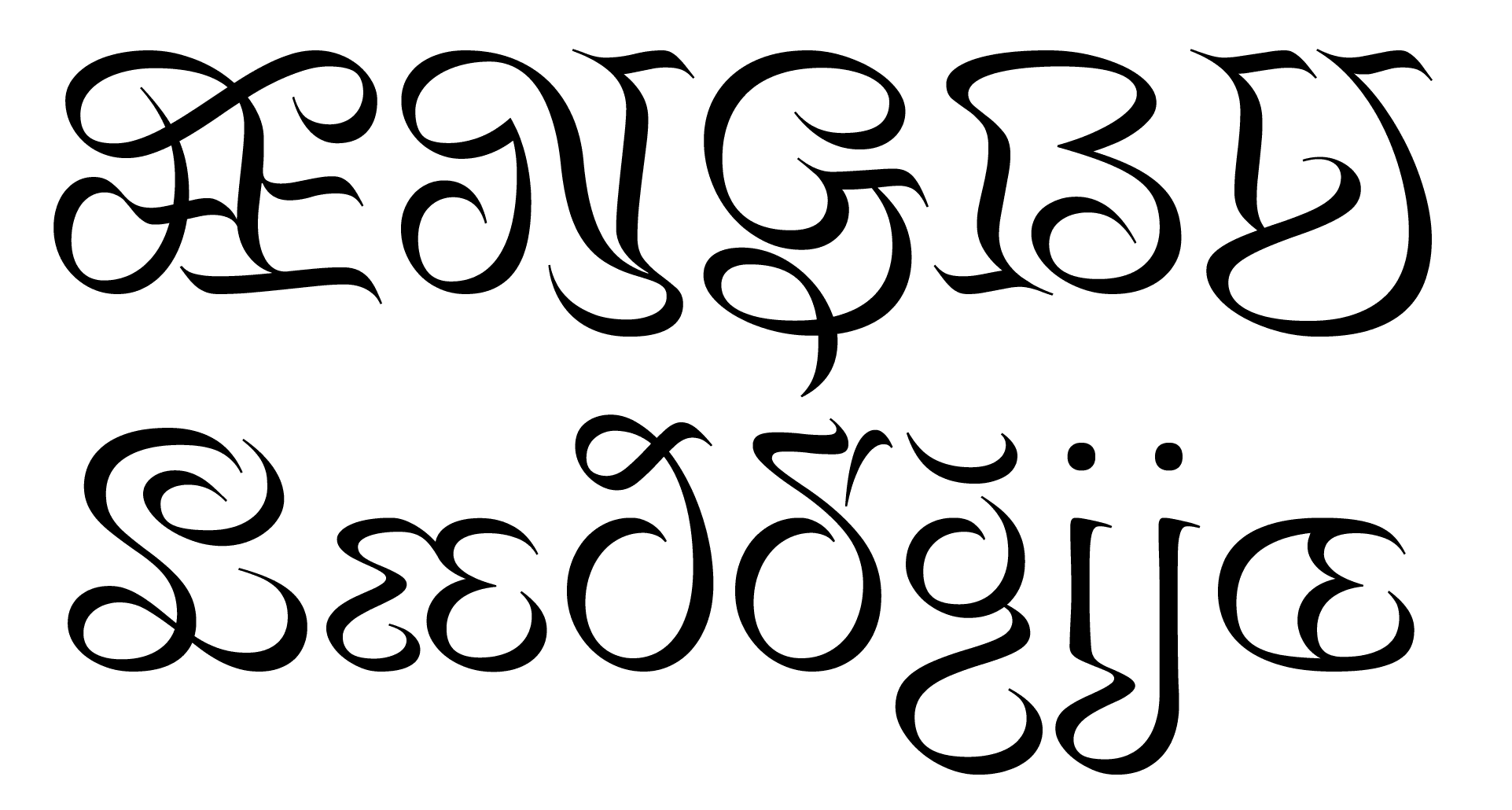
Æ (Ash), Ŋ (Eng), Ģ (G comma accent), ẞ (Uppercase Eszett), IJ (I-J digraph), Ľ (L caron), æ (ash), ð (eth), ď (d caron), ğ (g breve), ij (i-j digraph), œ (o-e diphthong). The L caron is so scandalous that it had to be condemned to a stylistic set.
Something old, something new, something beautiful
Mancine is reminiscent of Art Nouveau, while not imitating anything specific from the period. It is, however, made with many of the same principals in mind: organic curves, unusual shapes, a rejection of classicism, and finding inspiration in new, exciting places. That’s how I like to approach all my work: applying a direction of a certain art movement to a new idea.
Type design is inherently derivative, and finding fresh ideas is difficult. But there is a lot of uncharted territory in the world of the left handed penman, and I dare all to explore it.
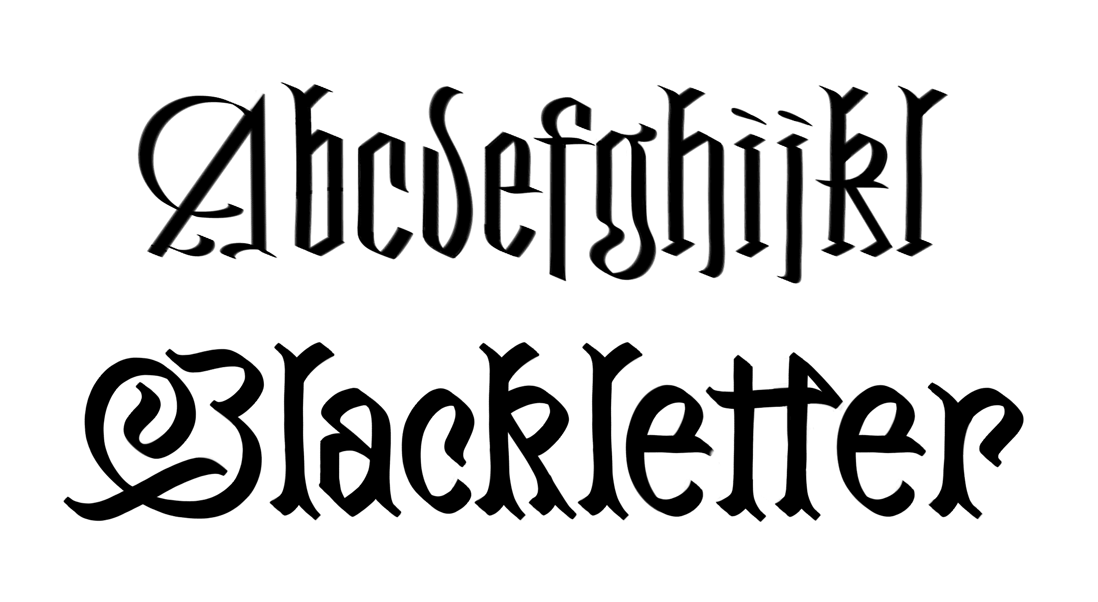
Left handed blackletter? I’m not gonna do it, but somebody should.
The name is after my wife, Katie Mancine. The woman and the font have a lot in common: an Art Nouveau elegance, charting their own course, and left-handed. Strikingly, “Mancine” means left-handed in Italian (from root Mancina, “Mancine” is the plural feminine form).
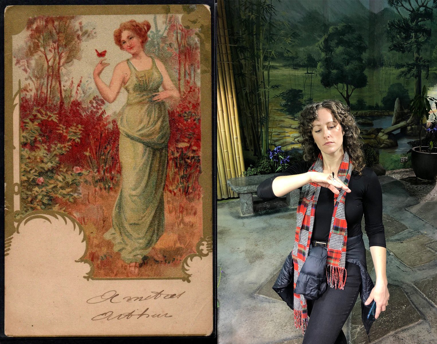
A lithograph from 1904 (artist unknown) and Katie on shrooms at the insectarium.
View, test, and buy Mancine here.
An enormous thank you to Phaedra Charles, both for the inspiration and for allowing me to use materials from her Sinistral guide in this blog post. View her awesome type library here.
Thank you to Katie Mancine for being an enduring source of support and inspiration.