
Ubique
Custom Typeface
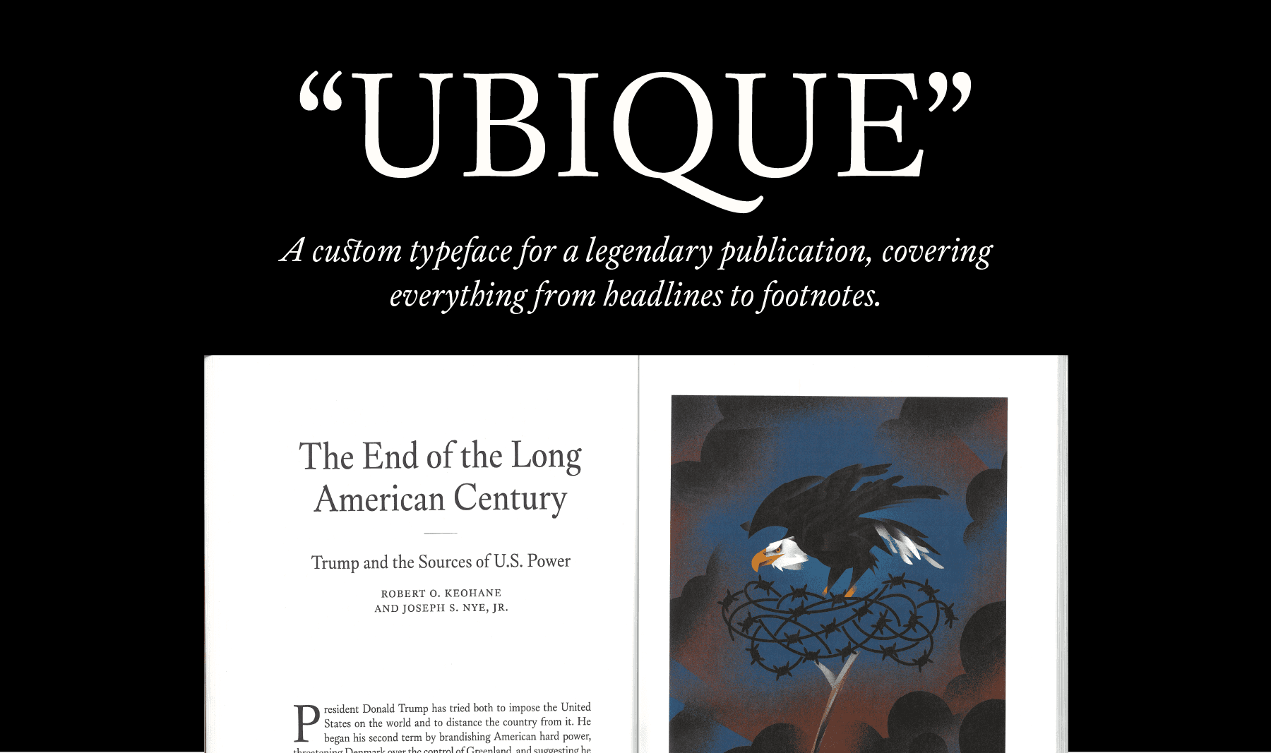
“Making Ubique was like forging a new tool crafted for one specific, perfect job. In our case, that means executing the exact typographic needs of Foreign Affairs, taking into account the magazine's long history and current ambitions. I couldn't be happier with how it turned out. It represents the legacy of our publication just right. Matthijs worked tirelessly on each detail, responding with rigor and thoughtfulness to queries and requests. It's been a delight to use something every day that has such craftsmanship.”
– Ed Johnson, Creative Director


Foreign Affairs was founded in 1922 as the foremost publication on American foreign policy, offering a forum to voices from different backgrounds, including John F. Kennedy, Hillary Clinton, Mikhail Gorbachev, and even Albert Einstein.
Since 2013, the magazine and website had been set primarily in Adobe Caslon. An excellent typeface, but not perfect. Creative director Ed Johnson understood the need for an upgrade. Besides bumpy outlines and a sometimes feeble texture, Adobe Caslon lacked features like small caps outside the regular style, while containing questionable elements — like an f_l ligature that can easily be mistaken for an “A”. While many contemporary Caslon revivals exist, none checked every box for Foreign Affairs’ needs.

That’s where the Herzberg Design Co came in. In close coordination with Ed & team, I designed a custom Caslonesque typeface from scratch: “Ubique”, named after Foreign Affairs’ iconic colophon illustration. Its duty was to provide a better reading experience for users and improve the design team’s workflow, while respecting Foreign Affairs’ established look and feel.
The process started, as always, with research. I spent much time diving into scans of Caslon’s original specimens, figuring out which elements were most important. In the days of metal type, each size of a typeface — 12 or 14 point, for instance — was a different font, cut separately. Each of Caslon’s Roman and Italic types have subtle differences in proportion, contrast, and form. It was my task to figure out what to preserve and what to modernize.

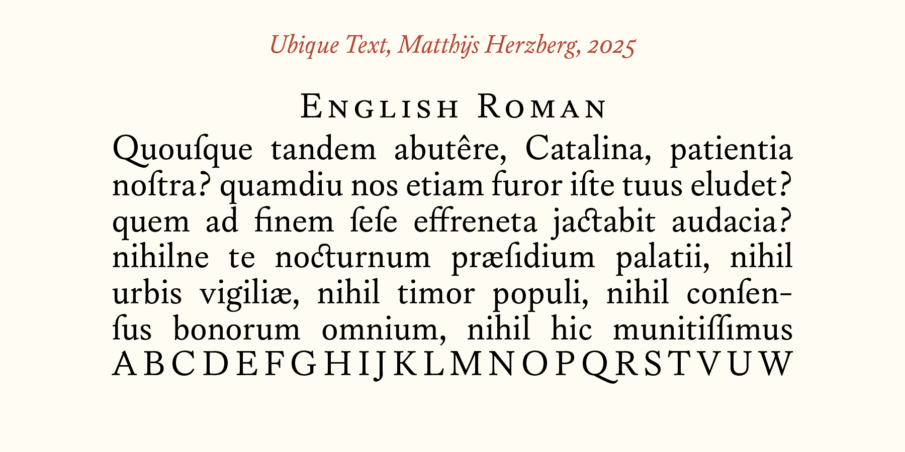
After a period of concepting, we arrived at a desired look: sturdy, but with soft printerly edges, and with more emphasis on weight in diagonal strokes, rather than the ‘picket fence’ look of Adobe Caslon. More prototyping followed, playing with parameters such as x-height and weight, until we established the perfect feel for Ubique.
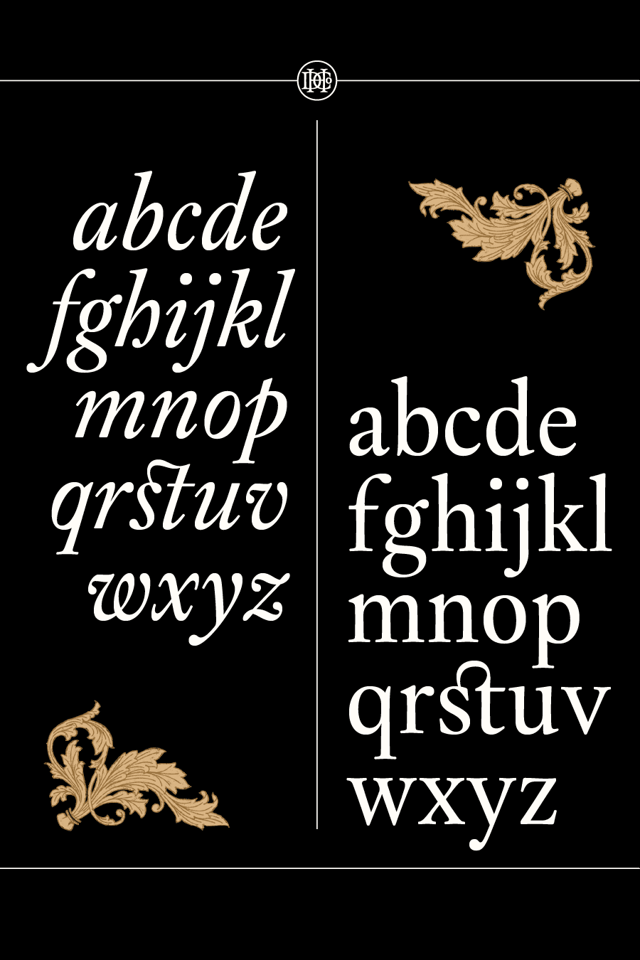
From there, I built out the full typeface: Roman and Italic in regular, semi-bold, and bold weights, each with three optically adjusted variants. Adobe Caslon has no specific optical sizes, which leads it to look fragile in body copy and inelegant at large point sizes. Ubique features a text version optimized for 12pt, with lower contrast and more generous spacing. Its display version is graceful and slightly more condensed—useful for headlines.


Ubique features an extensive character set of nearly 800 glyphs, uniform across each style so that features like small caps, arbitrary fractions, and case-sensitive punctuation are accessible in every weight, slant, and optical size.
There’s also tiny, hyper-specific things that only a custom typeface can provide. Foreign Affairs sets author names in small-caps. In a name like “McCarthy”, the “c” in “Mc” is supposed to be a little smaller, so we gave Ubique an extra-small-cap-C.


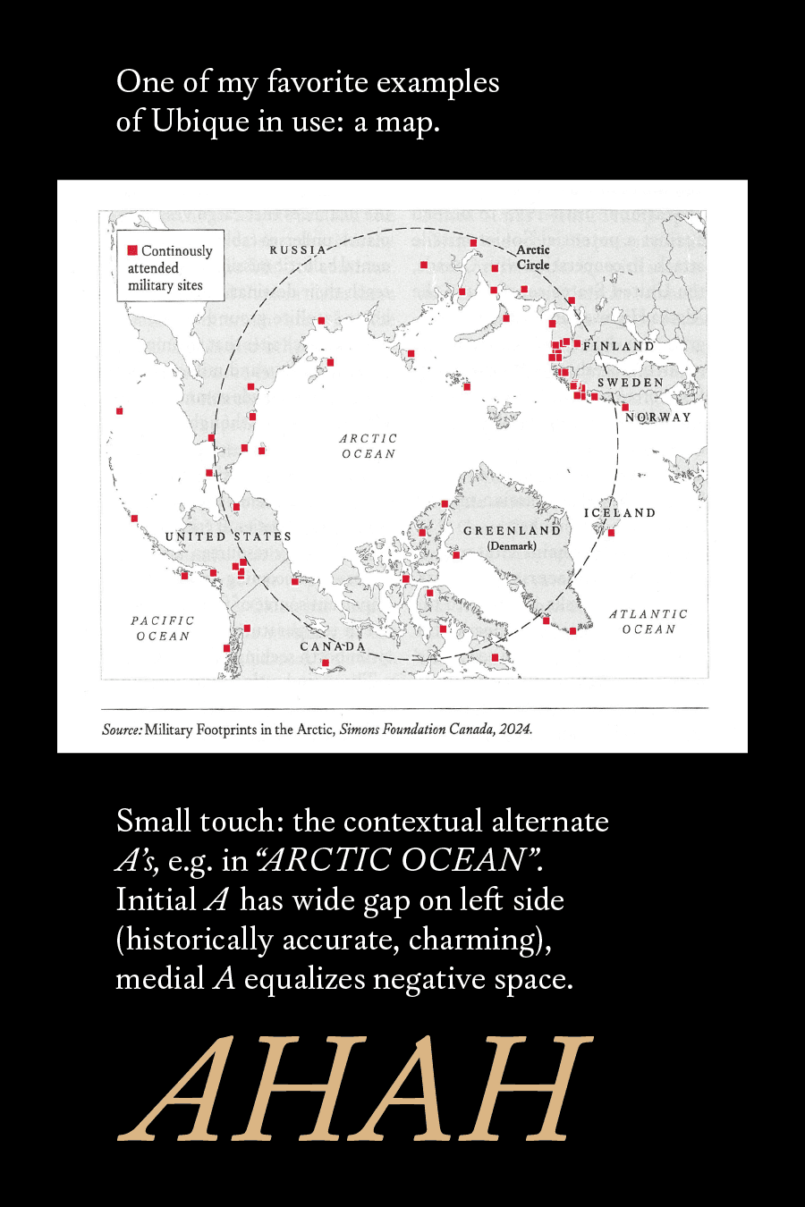
There’s a similar story behind many of the features that went into Ubique. I added a range of editorial icons as opentype-accessible glyphs, along with an alternate non-descending uppercase Q and J, which can be used as dropcaps without butting into underlying paragraphs.
Rather than assuming some hypothetical user’s workflow, I was able to coordinate with Ed exactly how everything could be implemented optically to make the job of Foreign Affairs’ design team as easy as possible. Similarly, many aesthetic decisions were left up to Ed & team —” this C or that C?” — in order to hit the mark perfectly.

To see Ubique in action, pick up a copy of Foreign Affairs Mag at your local newspaper stand or simply visit ForeignAffairs.com. Even the paywall looks good.

Need a custom typeface for your brand or publication? Let's talk.